- 02-06 – 前端JavaScript框架:jQuery Mobile
第二部分 – 第06章

移動網站頁面需要CSS和JavaScript實現展示(可視化佈局)和動作(例如用戶交互)。我們將部署一套常用的基於JavaScript的前端框架jQuery Mobile到我們的移動網站頁面上。
jQuery Mobile的好處
這些好處包括:
- jQuery Mobile是完全基於HTML5的,旨在開發具備響應性用戶界面的網站頁面,這種響應性用戶界面能在所有設備上(例如手機、平板或者桌面設備)被有效訪問。
- jQuery Mobile使得開發移動網站非常簡單,因為它僅需要極少的腳本,使用HTML5和CSS3完成移動優化網站頁面的佈局呈現。
如何部署jQuery Mobile
我們要使用jQuery Mobile創建一個簡單的移動網站頁面。
添加jQuery Mobile,JavaScript和CSS文件
為了使用jQuery Mobile,我們必須在head部分添加如下文件。
<link rel="stylesheet" href="http://code.jquery.com/mobile/1.4.5/jquery.mobile-1.4.5.min.css" />
<script src="http://code.jquery.com/jquery-1.11.1.min.js"></script>
<script src="http://code.jquery.com/mobile/1.4.5/jquery.mobile-1.4.5.min.js"></script>
因此移動網站頁面的代碼將如下所示:
<!doctype html>
<html>
<head>
  <title></title>
  <meta charset="utf-8">
  <meta name="viewport" content="width=device-width, initial-scale=1">
  <link rel="stylesheet" href="http://code.jquery.com/mobile/1.4.5/jquery.mobile-1.4.5.min.css" />
  <script src="http://code.jquery.com/jquery-1.11.1.min.js"></script>
  <script src="http://code.jquery.com/mobile/1.4.5/jquery.mobile-1.4.5.min.js"></script>
</head>
<body>
  <h1>...</h1>
  <p>...</p>
</body>
</html>
定義Pages
通過data-role屬性定義你的移動網站頁面為page。
<div data-role="page">
  ...
</div>
定義Header
通過data-role屬性定義你的header部分為header。
<div data-role="header">
  <h1>...</h1>
</div>
定義導航菜單
通過指定data-role屬性為navbar,在移動網站頁面的header部分定義一個多標籤導航菜單。
- 導航菜單上所有標籤均是可點擊按鈕。
- 在每個標籤中包含圖標。例如,主頁標籤就是由文本Home和圖標home(使用data-icon屬性)表現的。
<div data-role="navbar">
  <ul>
    <li><a href="https://www.mobilewebsitebook.com/" data-icon="home">Home</a></li>
    <li><a href="https://www.analyticsbook.org/" data-icon="arrow-r">Analytics Book</a></li>
    <li><a href="https://www.gordonchoi.com/" data-icon="arrow-l">Gordon Choi</a></li>
  </ul>
</div>
定義主體內容
使用data-role屬性定義你的主體內容部分為main,並指定class屬性為ui-content。
<div data-role="main" class="ui-content">
  ...
</div>
定義Footer
通過data-role屬性定義你的footer部分為footer。
<div data-role="footer">
  ...
</div>
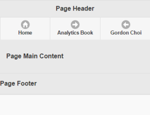
最終的jQuery Mobile頁面
將jQuery Mobile網站頁面合併到一起。
<!doctype html>
<html>
<head>
  <title>Page Title</title>
  <meta charset="utf-8">
  <meta name="viewport" content="width=device-width, initial-scale=1">
  <link rel="stylesheet" href="http://code.jquery.com/mobile/1.4.5/jquery.mobile-1.4.5.min.css" />
  <script src="http://code.jquery.com/jquery-1.11.1.min.js"></script>
  <script src="http://code.jquery.com/mobile/1.4.5/jquery.mobile-1.4.5.min.js"></script>
</head>
<body>
  <div data-role="page">
    <div data-role="header">
      <h1>Page Header</h1>
        <div data-role="navbar">
          <ul>
            <li><a href="https://www.mobilewebsitebook.com/" data-icon="home">Home</a></li>
            <li><a href="https://www.analyticsbook.org/" data-icon="arrow-r">Analytics Book</a></li>
            <li><a href="https://www.gordonchoi.com/" data-icon="arrow-l">Gordon Choi</a></li>
         </ul>
         </div>
    </div>
    <div data-role="main" class="ui-content">
      <p>Page Main Content</p>
    </div>
    <div data-role="footer">
      <p>Page Footer</p>
    </div>
  </div>
</body>
</html>
- 上一章:部署移動網站策略
- 下一章:用WordPress開發移動網站
移動網站性能技術白皮書在2017年3月正式出版。
英文版:Frontend JavaScript-based Framework: jQuery Mobile – 簡體中文版:前端JavaScript框架:jQuery Mobile
移動網站性能技術白皮書上的內容按下列許可協議發布: CC Attribution-Noncommercial 4.0 International
